AR DRINK AD
This project was part of a school assignment focused on creating an AR drink advertisement using Snapchat Lens Studio. While I had made a few simple filters before, this was my first time actually diving into Lens Studio with intention. It was also my first experience modeling in Blender, where I learned to manipulate basic shapes into more complex forms to create a polished bottle design. The process began with developing a user persona to help guide my creative direction and make sure every design decision—from color palette to interactivity—was aligned with the intended audience.
The product I created was Chupaquila, a fictional tequila brand inspired by bold Mexican imagery and desert landscapes. I designed the drink label in Illustrator, modeled the bottle in Blender, and then brought all the assets into Lens Studio to build the AR experience. Moving through these platforms helped me better understand how to carry a design system across mediums. Beyond technical learning, this project gave me a better grasp on how branding, storytelling, and emerging technology can come together to elevate a product. It also gave me the confidence to keep experimenting in the AR space and explore ways to make physical branding feel more immersive.


User persona for a trend-driven, experience-focused marketer.
For the AR drink advertisement project, I designed the experience with Jordan Castillo's persona in mind. Jordan, a 24-year-old marketer from NYC, is an experience-seeker who is always on the lookout for fresh, innovative, and aesthetic-driven content. They thrive in creative environments and value authenticity, which means they have little patience for low-effort, cookie-cutter experiences. Keeping this in mind, I opted for a clean, minimalistic design that emphasizes both visual appeal and functionality. The AR interaction was designed to feel fresh and dynamic, avoiding any generic or overused elements that would detract from the overall vibe. By leveraging innovative technology and ensuring the ad felt connected to the culture Jordan engages with, I aimed to create an immersive, visually exciting experience that would resonate with their desire for new, high-quality experiences. This approach ensures the ad appeals to their aesthetic sensibilities and aligns with their passion for discovering and sharing the next big thing in culture and trends.
For the Chupaquila label and brand identity, I started by building a Pinterest board to capture the right feel. I wanted to ensure it resonated with the user persona, someone like Jordan Castillo, who values authenticity, culture, and a bold, fresh approach. The name "Chupaquila" itself combines the mythic and the real, blending "Chupacabra" and "tequila" for a unique twist. I then turned to Illustrator, diving into the design process. Balancing distinct yet cohesive elements was challenging, but it was essential to create a look that felt both innovative and true to the tequila industry. Finding the right colorway was another hurdle, but I pushed through to ensure it felt premium yet approachable. To make sure I had all the necessary details, I used ChatGPT to double-check that the design included every required feature of a real tequila bottle, like the CRT number and the 100% agave listing. This process kept the design grounded in authenticity while giving it a contemporary edge that would appeal to someone looking for the next big thing in the market.


Quick mockups and rough drafts.

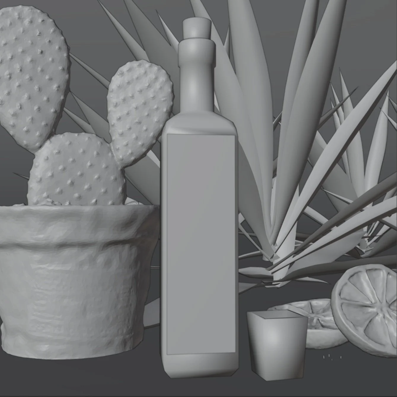
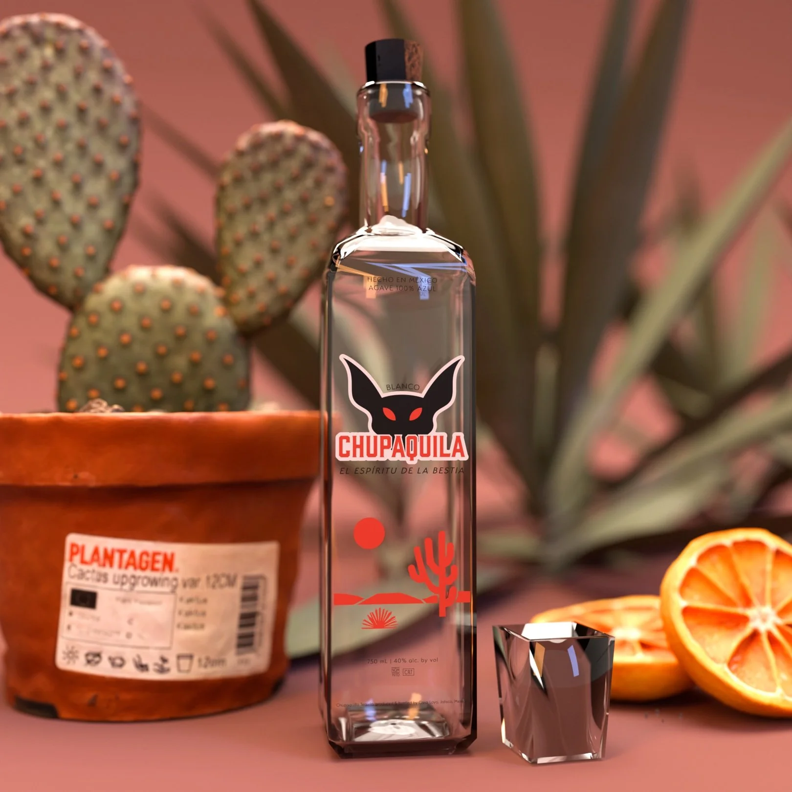
Blender shaded view and final render.
In Blender, I built the Chupaquila bottle starting with a basic cylinder, gradually shaping it into a more refined and realistic form through careful manipulation of vertices and edge loops. To bring it to life, I explored a few tutorials to create convincing glass and cork materials, which pushed me to dive deeper into Blender’s node system than I ever had before. While those materials were eventually swapped out for simpler ones in Lens Studio, they were used in the final render and added a polished, photorealistic touch to the visuals. Applying the label was a smooth process since it sat flat on a plane rather than wrapping around the bottle.
To complete the scene, I modeled a simple shot glass and downloaded assets from Sketchfab. I adjusted their colors using hue/saturation nodes to match the overall palette and vibe of the project. For a final detail, I used Meshy.ai to generate a stylized orange slice, adding just the right amount of extra flavor to the composition. This process not only helped me get more comfortable with 3D modeling but also taught me how to build a fully art-directed render by blending original elements with sourced assets.
Lens Studio and Final Result
In Lens Studio, I pushed beyond the basic filters I had experimented with in the past and took a much deeper dive into what the platform is capable of. I explored a variety of effects—like head binding, background replacement, and even subtle eye color manipulation—to make the lens feel more immersive and dynamic. One of the trickier challenges was getting certain images to respond correctly to the head occluder, which hides objects behind the user’s head in 3D space. Some elements weren’t reacting as expected, but I was able to troubleshoot the issue by adjusting individual image settings and testing different configurations until it looked right.
This project taught me a lot about how to problem-solve within technical limitations while still holding onto a strong visual and conceptual identity. It forced me to wear a lot of hats—designer, 3D modeler, animator, and even audio engineer—and tie everything together into a cohesive experience. While there are still things I’d refine with more time, I’m proud of how far I pushed myself across new tools and workflows. The final result is playful, weird, and engaging—which is exactly what I wanted Chupaquila to be.


